One of the things I’ve been trying out is reworking a piece of text into a completely different style. A full exposition and explanation are given here:
In today’s experiment I’d like to tell the story in the style of a review of an art exhibition. First, though, here is the original text on which these experiments or transformations are based:
The original (template) text
In the middle of the night, I woke up (if you can call being semi-conscious being awake), walked purposefully towards the door to go to the bathroom — and almost knocked myself out.
The reason was that in the twin states of entire darkness and semi-somnambulance I was facing in a different direction from the one I thought I was facing. As a result, instead of walking through the door, I tried to walk through the wall.
The next few days brought nausea and headaches. After much prevarication I went to Accident and Emergency, where I waited petrified among people for whom “social distancing” means not quite touching you, and who wore their masks as a chin-warmer.
An hour and a half later I emerged into the twilight, secure in the knowledge that I had nothing more serious than mild concussion. I failed to do much writing, but I was pleased to have read a further 17% of my book.
Art Critic version
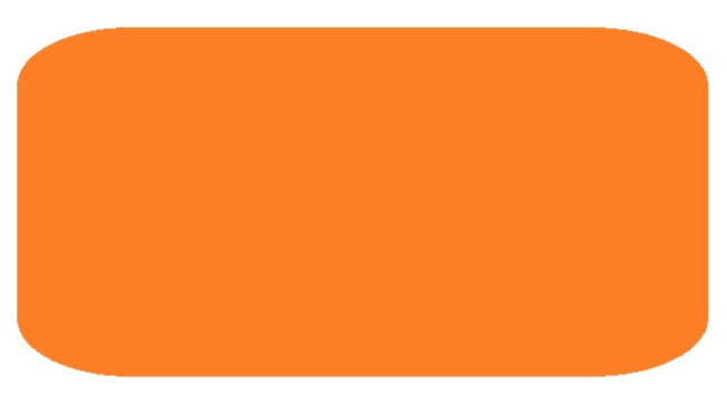
In this latest exhibition of Freedman’s artwork, The Abstract Years, one item in particular stands out. His portrayal of an incident in which, as a youth, he banged his head on a wall is as poignant and striking today as if the accident had occurred just yesterday. As Freedman has written in his Manifesto, the role of the artist is to represent three dimensional reality on a two dimensional canvas. Rising to the challenge, he has adopted a minimalist approach that invites the viewer to enter into a compact with the artist in psychoconceptual terms. The viewer thereby becomes an active participant in the experience rather than merely a passive observer.
The rounded edges of the rectangle suggest a softening, an allusion to the fact that the artist had been diagnosed with mild rather than severe concussion. The pink colour – almost the colour of blood -- reminds us of the angst the artist suffered while waiting among people who acted as though they were completely oblivious to the pandemic raging at the time. An experience which, thankfully, proved non-fatal in the end.
What we must also note, however, is an absence: the complete non-appearance of anything remotely connected with the craft of the writer, the profession Freedman enjoyed at the time. This represents the fact that he achieved none of his writing goals during this period. However, the shape of the rectangle may also be assumed to be an oblique reference to a book, indicating that the artist at least managed to read something.
Although the painting is essentially one-dimensional – the lack of shadow or shading eschews the idea of depth – it also hints at the existence of dichotomies, pulling both the viewer and the artist in opposing directions. Thus the painting is, in effect, in a constant state of flux, ever teetering on the edge of disjunction, even rupture.
The Abstract Years is currently showing in London’s Art in a Cart until it closes.
Acknowledgements
My thanks to the many art exhibitions I’ve been to in the hope of learning something concrete about the items on display.
Also, to Artspeak. The Bullshit Language of Art.
A few notes
Look, first of all, apologies to the art experts among us, but you have to admit: to those of us who don’t know much about art but know what we like, the text accompanying artworks is usually less than enlightening. One cannot help but wonder: is it actually meant to be enlightening, or is it a ruse to keep us poor uncultured and uneducated plebians in our place?
However, I’m obviously not the first person to notice all this. A few years ago I attneded an exhibition at the Los Angeles Museum of Modern Art with my cousin (R.I.P.). She was a graphic artist, and had a degree in art therapy. In other words, she knew relevant stuff. After reading a few of the notes next to the paintings, I called her over.
“Look”, I said. “Does this stuff mean anything, or is it hogwash?” She read it and then, at the top of her voice (and she had a really loud voice) shouted “CRAP!”. Well that answered my question rather succinctly.
In one of his oneupmanship books, written in the 1940s and 1950s, Stephen Potter recommends, when attending a modern art exhibition, ignoring the exhibits and walking up to a fire extinguisher, saying something like “Now that, to me, is a true piece of art.”
Anyway, I hope you enjoyed this version of my story. If you did, there are plenty more indexed here.


Bravo! By the way, I miss the Sotheby's auction with your graphic report. Freedman, famous activist on the CRAP current, Canvas Renamed After Painting, bang our minds with bla, bla, bla... 10.000 £
Love this one Terry: I too believe that the vast majority of writing about art is complete hogwash. Very rarely does it add to my art appreciating experience. By that token, your piece succeeded spectacularly! 😉